London’s unique tournament, The Unity Cup, has been revived again 21 years later, and fans are loving it.
The competition was first held in Charlton Athletic’s ‘The Valley’ stadium, back in 2004, which helped raise money for the Damilola Taylor and Stephen Lawrence charities.
Over two decades later, the competition has grown for its second edition, being hosted by the mighty ‘Bees’ in Brentford’s G-Tech Stadium.
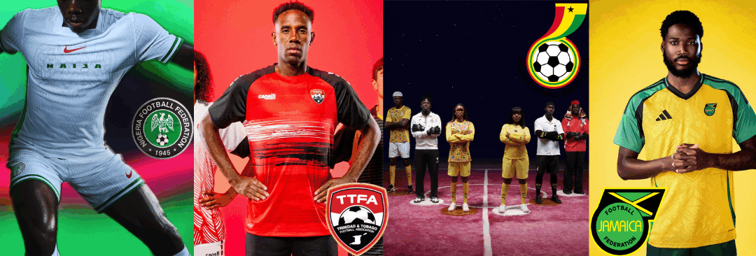
Competing this year, Nigeria, Ghana, Jamaica and Trinidad and Tobago, will be battling it out to find who is the superior team in London’s melting pot of cultures.
Yesterday saw a 3-2 victory to the ‘Reggae Boyz’ against Trinidad and Tobago.
However, The Kitroom Collective will be doing their own sort of ‘Unity Cup’. We are going to rank each team’s shirt to discover who would raise the trophy, from a fashion perspective.
4. Trinidad and Tobago
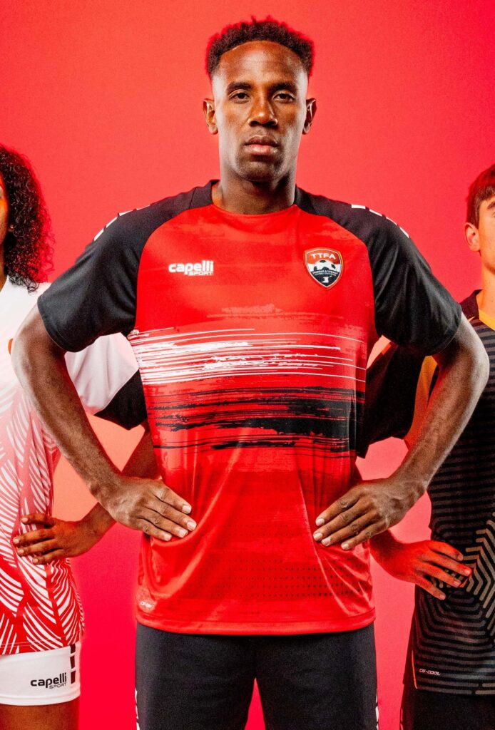
This bright and bold kit was inspired by the island’s beautiful landscapes, reflecting their extravagant coastlines and mountain terrain. However, it seems to have fallen short when communicating that.
What they describe as incredible views is created through lines that do not really replicate much. Using the colours on the countries flag, what they see as being scenic views just comes across and randomly placed scribbles. In addition to the blocked colours of the sleeves and random dots at the bottom, the shirt falls last in the ‘Unity Cup’.
3. Jamaica
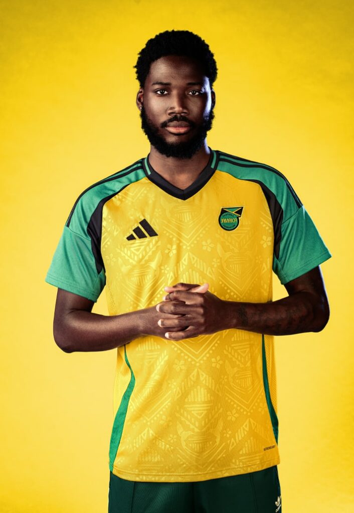
Jamaica have had some iconic kits in the past, but this one seems to fall short.
The modern Adidas logo along with the subtle shimmering design of doctor birds and their national flower, the lignum vitae, on the torso provides something new and sleek.
Although miles ahead of Trinidad and Tobago, the competition from the other shirts in the cup are strong and Jamaica’s kit struggles to compete.
The base design is similar to those of previous years and the design, although visually pretty, can get lost in the brightness of the yellow. The sentiment of strong bold statements in the other two kits is not shared with Wales Bonner’s design, therefore it stays out of the final.
2. Ghana
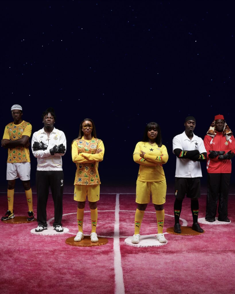
Puma and Jefferson Osei have combined to make Ghana an iconic kit filled with traditional symbols known as Adinkra, representing values of resilience and cooperation, also being a tribute to the many nations tribes.
In addition, when players sweat the colours begin to change making the symbols more saturated as the game goes on, an incredibly unique and well-designed idea, further representing their pride for the badge.
These details and others explored in https://jusmedia.co.uk/kitroomcollective/?p=41863 are the extra decisions that separate the greatness in between the other kits in our Unity Cup.
1. Nigeria
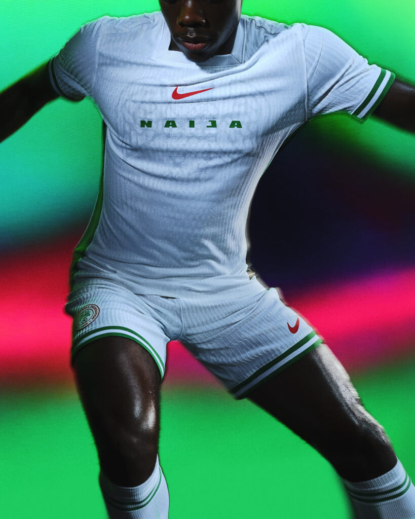
This is the winner.
The ‘Super Eagles’ have done it again with a new white home kit that subtly shows the bird drawing on the chest behind the ‘Naija’ jagged and modern typography,
The off-white crest along side the green accents on the sleeves, is finished off with Nike’s iconic bold tick in orange.
The square collar adds more subtly unique quality that we rarely see in football kits these days.
The Kitroom Collective believe this kit raises the trophy, due to clean finish of the kit with minimalist yet iconic design that just might take this team all the way to the top of the Unity Cup.

