")
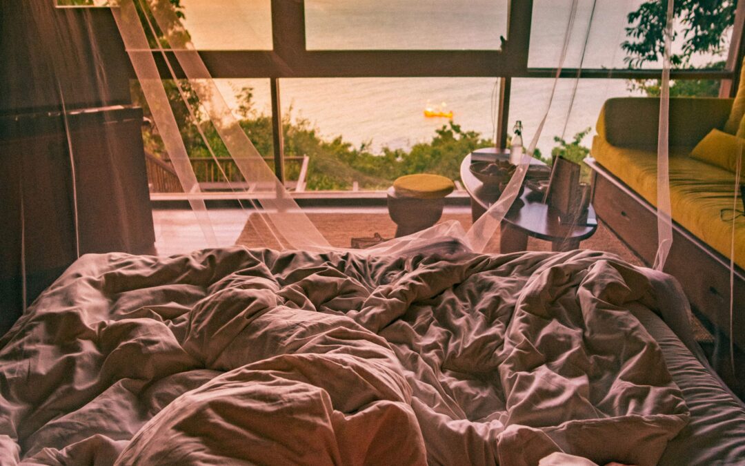
You get into your bedroom after a long day. You’re ready to wind down, but something feels off. The walls around you are a harsh red, making it feel difficult for you to relax.
We don’t often think about how colour can affect our mood, but it can make a real difference in any room, especially the one designed to be the most relaxing of all: the bedroom.
Colour psychology studies how different colours affect human emotions and behaviour. Certain shades can help create a calm environment, perfect to be plastered on the walls of your bedroom, while others are better suited to paint the walls of a nightclub.
So, what colours actually support a good night’s sleep?
Pale Blue

According to colour psychology, pale or pastel blue is a non-aggressive colour that encourages serenity and tranquillity. The soothing connotations are often attributed to our mental association of blue with the ocean, explaining why people may find the colour calming and peaceful. A 2020 study surveyed 4,598 people from across 30 different countries on their emotional associations with colour. The survey found that 35% of respondents linked the colour blue to feelings of relief. The colour’s tendency to promote healing and softness in environments makes it an excellent choice for the walls of your bedroom. Doze recommends Blue Ground from Farrow & Ball.
Sage green

Colour psychology concludes that sage green is representative of renewal and growth, provoking a sense of comfort and relaxation in human behaviour. The freshness of the shade combined with its associations with nature work to evoke feelings of security and peacefulness. The survey found that 39% of people link green to contentment. These tranquil properties make it a good fit for the bedroom. Doze recommends Card Room Green from Farrow & Ball.
Light pink

Light pink is a colour that evokes feelings of tenderness and compassion. The calming and soothing colour can evoke a sense of relaxation and tranquillity. With the survey finding that 50% of people link the colour pink with feelings of love, light pink is both a perfect and popular choice for the colour of bedroom walls due to the peaceful and serene environment it creates. Doze recommends Middleton Pink from Farrow & Ball.
Lavender

Colour psychology suggests that for many people, the mental effects of the colour lavender mirror the effects of the flower with the same name. The plant’s many medicinal properties strongly associate the colour with feelings of healing and relaxation. The colour survey found that 25% of respondents associate the colour with feelings of pleasure, which, in combination with the calmness and tranquillity of mind lavender encourages, makes it more than suitable as a colour to paint your bedroom. Doze recommends Calluna from Farrow & Ball.
But are there any bad choices for the walls of your bedroom?
Although colour is highly subjective, research suggests that some colours do not belong in the bedroom.
Colour psychology details the pessimistic and depressing psychological effects of the colour black, which was reinforced by 51% of the colour survey respondents linking the shade with sadness, rendering it an unfitting choice.
Despite 68% of survey respondents associating the colour red with love, the colour is known to have both physiologically and psychologically negative effects on people. Its links to violence, danger and lust make it an unsuitable selection for your bedroom.
And finally yellow. Despite being a vibrant and positive colour, with 52% of people linking the colour with joy, the warmth and vibrancy of the colour proves to be too overstimulating for a room required to promote relaxation.
Sponsored by Farrow & Ball ***
For more essential sleep knowledge: